DOWNLOAD The Nik Collection for Free! In March of 2013 Google announced that all Nik Software plug-ins would be bundled toget...
The Nik Collection for Free!
In March of 2013 Google announced that all Nik Software plug-ins would be bundled together into the Nik Collection for just $149! The bundle includes HDR Efex Pro 2, Color Efex Pro 4, Silver Efex Pro 2, Viveza 2, Sharpener Pro 3 and Dfine 2.Note: Google has discontinued all discount coupon codes for Nik Software.
Nik Software Review
All the Nik software is good and fun to use. The “fun to use” is perhaps a strange thing to say in a review, but many of you already know that my reviews are often atypical. I tend to be short and sweet in these reviews, just quickly giving my opinions and providing examples of a few of the options that I use. And, frankly, I think editing photos is quite fun, so it’s always nice to have post-processing software that makes me smile.Another aspect of my reviews is they are chock full of huge screen shots. I learn by example, and maybe you do too? This selection of shots should give you a pretty good idea of the range of the software.
Now, there are SEVERAL products in the Nik Software suite. This review will describe four of them. I will spend more time on some than others. Here are the ones I will discuss, in order of the time I will spend on them:
- Color Efex Pro - A very cool package that comes with tons of effects. You can even do HDR-like effects with one of them.
- Silver Efex Pro - For incredible and easy B&W conversion. Think B&W conversion sounds boring? It isn’t with this thing…
- Sharpener Pro - Some very nice algorithms for making your photos pop
- Viveza 2 - Slick software for doing localized control of things like contrast and saturation.
- Complete Collection – Note I am not reviewing this specifically, but this is a package you can get from Nik Software that includes all of the above products together as one.
Nik Color Efex Pro
Color Efex Pro is probably the coolest of all the Nik Software products and the one I use the most. In short, it opens up a new dialog that is filled with a wide variety of filters. The filters do SO many different things, that it would be silly to list them all out here. So, instead, I’ll just briefly discuss a few of them.Below, I have a variety of screenshots of some of the effects. Essentially, what you will easily see is that there are a ton of filters down the lefthand side. The filter is immediately applied and then there are many sub-options on the right. The sub-options give each of the filters a much more granular level of control.
Because each filter on the left is unique, the sub-options on the right are even more unique. Each effect on its own has a million possible outcomes based on your sliders on the right. There is a pretty good example of this in the “Old Photo” screenie below.
Now, it is said that too many choices can paralyze people. I think this can be true. BUT, if you go into a tool like this with an open mind, and freely surf around some options, I think you will really come away impressed with some of the creative things that will happen to your images. Like anything else, the more you practice, the more you can begin to have a bit of volition in your efforts.
One great feature of all the Nik products is that it duplicates the layer for you. Often times, the “effect” may be overdone and you will want to dial it back, or mask with the original image. This allows you to do that.
So, what effects do I use most? I hate to list them out here because the list is going to be a bit skewed to where I have the most familiarity, but maybe that is okay. For one, I like “Tonal Contrast” a lot. It does something very similar to HDR, in which it manipulates contrast and light levels on a very small scale. It has it’s own set of sliders as well that enable you to effect how “punchy” the HDR effect is.
I have attached a few images of Nik Color Efex Pro “Tonal Contrast” below:
Other filters that I use on occasion are “Film Effect”, “Colorize”, “Glamour Glow”, and, “Indian Summer”. I’ve actually tried all of them… and there are many cool ones. So don’t neglect those just because I haven’t given them any screenshot love…

This is the before shot. It is an Argentine artist in her studio. It was shot at 70mm at f2.4.

The Tonal Contrast options for this shot made it a bit over-baked, but it does show off what it can do. I dialed it down for the final product.

Sub options for Tonal Contrast

This is a zoom-in of the Loupe for the wall texture.
You can see how the microcontrast has really made it pop.

This is the “Glamor Glow” video. I don’t really ever use it… it is kinda that “mall shot” effect.

The Original Shot right outta the camera (50mm f1.4)

After Brilliance/Warmth filter with the slider slid towards the warmth side

Tonal Contrast is one of my favorite and can create an HDR-like effect

The Indian Summer filter gives your photo a warm glow

The Bleach Bypass filter gives quite a dramatic effect. It’s not very natural, but cool nonetheless.

Film Effects can add a nice grain and texture. You can see that I selected some Kodak film that people probably learn about in film school.

The colorize option can give the photo a nice sheen while still maintaining elements of the original color.

Here is the “before” shot of a strange area full of crypts in Buenos Aires

The sunshine filter gives a strong but interesting effect

Here is an after version with the “Old Photo” filter turned on

Old Photo has a ton of sub-options on the right

Last, I’ll show another example of what is possible with “Tonal Contrast”. This is a huge solar-tracking sculpture.
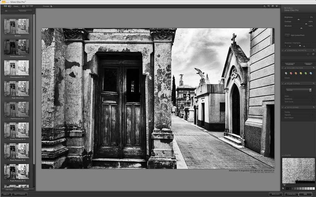
Nik Silver Efex Pro
Wow this thing is cool. Those of you that are regular readers to the blog know that I don’t do a lot of Black & White photography. I have nothing at all against it… I see things in a very vibrant and alive way, and I’ve spent a long time perfecting a technique that helps bring this to photographic reality. However, that doesn’t mean I don’t appreciate a good B&W pick. Often times, the default B&W conversion in Photoshop can just be… well, boring. And predictable. Sometimes I take something and convert it to B&W and then look at it and think, “Yeah, well, that’s how I kinda thought it would look”.So, I reluctantly tried Silver Efex Pro, because I expected it to be a slightly improved version of what Photoshop can do — but I was wrong! This is very fun to use and you can get a wide variety of looks. Frankly, I really like the Holga and Pinhole settings on the left, and then tweaking it further on the right. There are many many wonderful options here that can really make a B&W image “alive” and pop off a page.
By the way, I have similar information up on the Silver Efex Pro Review.
Below, I have put several screenshots of the things I have done with the product, so you can begin to get an idea.

Silver Efex Pro enables you to make a choice on the left to give you a basic look, then you can really make it unique on the right.

The Antique Photo treatment sounds like a gimmick. But it came out fairly amazing, don’t ya think?

The Holga and Pinhole treatments are two of my favorites.

Silver Efex’s B&W options can enable some cool results

When it comes to Vignette, the “Stylizing” dropdown has a ton of very easy-to-use options
Nik Sharpener Pro
I have also tried Nik Sharpener Pro 3.0. It is a fine product. It does exactly what it advertises. I find the sharpening to be a grade better than what is in Photoshop by default.I am always surprised when I use this software! I usually shoot on a rock-steady tripod. This gives my camera incredible sharpness. I zoom into 100% in Photoshop and it looks great to me! And THEN I run Sharpener Pro and I am shocked. It has a little loupe where you can compare the “before and after”… and then I look at what I thought was sharp before and suddenly it looks blurry in comparison.
I have posted a few shots below for you.
 The Output sharpener brought great details. Check the Loupe on the right (before left / after right)
The Raw Presharpener ads some nice details and pop. Before is on the left and the after is on the right.
Viveza 2
Viveza is a very interesting and useful filter.It is also strange! I don’t know who came up with the GUI for this thing, but it is, frankly, weird but cool. Let’s just say it is “cool” after you get the hang of it. I spend a lot of time with various UIs, so I figured it out pretty easily, although I am sure it would be confusing to a lot people.
The best way to explain Viveza 2 is that it lets you change one part of a photo without changing another part. These localized changes can be subtle or extreme, based on your preferences.I find that sometimes, especially with my HDR work, that some areas can become oversaturated. Viveza 2 allows me to go in and desaturate one area while leaving the other bits saturated. This is a pretty handy fix.
It’s not just Saturation — I should not use that as an example I suppose, because there are so many things you can change. Contrast, Warmth, Shadows, Structure, and more are easy to control.

The Viveza 2 UI is the usual Nik look. Sleek. Black. German.
Control Points
Nik has this interesting UI way of interacting with your image called “Control Points”. These are little “Dots” (for lack of a better word) that you drop on the part of your photo that you want to mess with. When you click on that “dot”, a local tree of options explodes outward. It’s very cool. The top control allows you to adjust the “radius” of the working area. The other nodes of the tree allow you to change saturation, contrast, brightness, structure, and all those sorts of things. You can see a lot more by zooming in on the screenshots.
Dropping
control points to fix parts of the image is a simple matter of clicking
that control points button in the upper right, and then clicking inside
the photo anywhere.
A Replacement for Masking
I find that “Masking” in Photoshop is one of the hardest things to teach people. I understand why, because I remember my struggles in understanding it in the beginning. Well, these control points really allow you to accomplish the whole thing without masks. In my experience, dropping a control point down is a lot easier than doing a mask.
You
can see that in this area in the river, I have dropped a control point
to reduce the saturation. It can also be changed on the right in the
sidebar.
The Sweet Structure Slider
There are many sliders to control – but don’t forget to play with the “Structure” slider! It’s the secret gem in here! Sliding that thing around can really help add detail and “pop” to part of the photo. In the example screenshot, you can see I added a lot of structure detail and pop to the middle of Notre Dame.Note that you don’t just have to add “Structure” to structures. So maybe this was a bad example! But, you can apply it to the eye of a model, the texture of a couch, or the leaf of a flower. That “pop” in an area of a photo is a very nice effect!

I have made a few changes on this control point, but my favorite is that "Structure" slider.